Hardee’s: For Love of Burgers, Type

Hardee's Classic Logo Outside

My wife likes to remind me when we’re out to eat that there are other things on the menu besides cheeseburgers. What? I beg to differ.

I don’t know where my love of burgers comes from originally, but I do I remember going to Hardee’s on Millersville Pike as a kid vividly. (It’s not there anymore.) Specifically, I remember the first time I looked at the logo and realized the “a” and “e” were the same letter forms. I was so proud of myself. Let’s take a look at the logo below.

Hardee's Classic Logo Letter Forms

The shape is flipped 180 degrees and is actually a bit rounded out on the “e”.  The leading edge of the letter form is also angled slightly different but that’s because of the faux perspective they put on it. The angles would be off if it were not adjusted. So it’s not exactly the same shape, but close enough.

Sadly, Hardee’s is now Carl’s Jr. of which we have none, and the super text logo is gone in favor of a star and script. I’m not sure what about the star says “good burgers” but I wish the would have the opportunity to find out.

Hardee's & Carl's Jr. Updated Logo

You can read more about this logo over at Brand New by Under Consideration.

Alternate Logo Designs for Citadel

Here’s a collection of alternate Citadel logos I’ve developed over the years. Citadel has a well established brand and it’s important to use that visual recognition when introducing a new concept, product or service pledge. In the various logos below I’ve carried over color, shape, font and feel to extend the original Citadel logo.  A few of them are subtle but each of them add new meaning and a unique twist.

1.

Citadel Class Service Logo

Citadel Class Service Customer service pledge

2.

Citadel TV Logo

Citadel TV In-house television network

3.

Citadel Safe, Sound, Secure Logo

Safe, Sound and Secure Logo designed in response to financial crisis

4.

Citadel Market Rate CD Logo

Market Rate CD Promotional product logo

5.

Citadel Switch Kit Logo

Switch Kit Logo for branded online bank account migration

Promotional Poster for Citadel

Citadel needed a way to impressively introduce its new line of checking accounts aptly named the STAR family. And everyone knows, if you’re looking for a real star, you’re going to find it in Hollywood. I had a general concept in mind for the poster that included replacing the famous ‘Hollywood’ sign with the Citadel logo, using a red carpet and throwing the whole thing up in lights.

1. Concept

A Hollywood premiere for something quite commonly very un-Hollywood. That was the approach to introducing a new product line and creating some “sizzle ” for the brand. I found a great stock illustration at iStock to start my design and then did a nice pencil drawing to get the basic layout and think through some of the major elements.
Hollywood Pencil Sketch Detail
Pencil sketch detail of the Hollywood sign being replaced the Citadel logo.
Hollywood Color Sketch Detail

Colored in detail of the new Citadel sign.

2. Mock Up

I like to use a sketch to get the layout and afterward quickly put some color in to get a feel for the entire look. In this project, I scanned in the original sketch and used Photoshop to add the color on a separate layer. I used a watercolor brush to keep the same raw feel of the sketch.
Hollywood Sketch Full Comparison

Side-by-side view of the original pencil sketch and the colored version.

3. Final

After I had the final colored version of the layout, some minor adjustments were made to the copy and concept. The headline was changed and the number of elements in the middle was reduced to three. Also, a collage of electronic items was added to the bottom to show some of the swag they were giving away in announcing the new accounts. I recreated the Hollywood sign in Illustrator using the 3D Extrude and Bevel combined with a warp effect to get a vector version to use  in the final rendering.
Hollywood Final Detail

Detailed view of the Citadel sign from the completed poster.

4. Conclusion

The poster has been cleaned up and completely rendered out in Illustrator and then transferred over to Photoshop to add the finishing touches.
Hollywood Final Full

The Citadel Star Checking accounts were very successful in aqcuiring new accounts thanks  to the buzz created from these great posters. The design was printed in several formats and the layout altered slightly depending on the situation.

Logo Design for Doachie McHugh’s

A bar. An Irish bar. An Irish bar that loves the Phillies.

An Irish bar that loves the Phillies and needs a logo?

Talk about a dream job! The combination of those four magical things led to the development of the Doachie McHugh’s bar logo. Let’s walk through the process of creating a logo from start to finish to get a feel for the entire creative process from initial concept sketch to finished logo.

1. Concept

The concept is an Irish bar who loves the Philadelphia Phillies. Simple enough. Let’s get started with some rough sketches. This hand drawn step is very important to get a lot of ideas out quickly and to get an idea of what looks best on paper before you sit down at a computer. The more the merrier, so here’s a sample of the concepts I sketched out for Doachie McHugh’s.

Doachie McHugh's Sketch 1
You can see the traditional Irish claddagh in the sketch above and the eventual Phillie-esque shapes start to come alive .
Doachie McHugh's Sketch 2
Some of the type and outlining is starting to come alive here.
Doachie McHugh's Sketch 3
Some explorations of the home plate shape to outline the logo and incorporate the baseball theme.

2. Sketches

After seeing some initial thoughts come to life and sharing them with the client, it’s time to give the best concepts a little more thought. At this point I like to move from pencil/pen/sharpie into pencil/color marker mock up. The crown from the claddagh was chosen along with the baseball for the letter “O” and a base for the outlining shape.
Doachie McHugh's Marker Sketch 4

3. Mock Up

After sharing the color markup sketches with the client some final decisions are made. Make it more like the Phillies logo, use the rounded top home plate shape and add some more color, like blue and red!
Doachie McHugh's Photoshop Sketch

4. Final

Some final color selections have been made and we have a completed logo. This is the point where I take the sketches and scans and move them into Photoshop and then later Illustrator to add the polish.
Doachie McHugh's Sketch 6

5.Conclusion

You can see how important it is to work through this process from sketch to completion based on the final rendering. I’ll readily admit that I don’t do this on every project due to time or budget… but I’m always much more satisfied with results when I do!

Logo Design for Sophie’s Tavern

Sophie’s Tavern has been located in the heart of Camden, NJ since they first opened their doors in 1933. It wasn’t until they recently renovated the building that they actually thought about having an official logo.

1. Concept

Sophie’s wanted something that reflected the building since it has remained largely untouched through the years and is very visible in the community. It is also one of the few remaining original buildings as Camden is undergoing a larger revitalization process and will help reflect the history of the tavern. Other than that, they wanted a pretty hometown feel for a local watering hole that everyone loves going to.
Sophie's Tavern Images

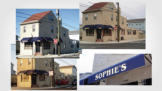
A few images of Sophies Tavern to work from.
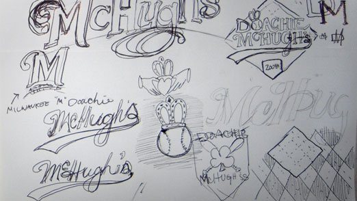
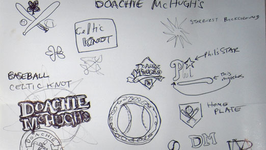
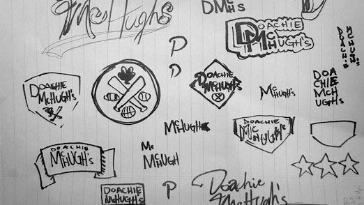
2. Sketches

I did  a few quick sketches and sent them to the folks over at Sophie’s Tavern to get there opinion.  I did a few “classic” bar and beer label layouts to get a feel of how the building was going to interact with the text andwhat the overall shape was going to be.

Sophie's Tavern Sketches

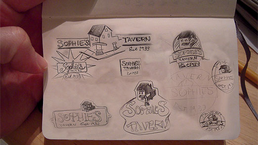
Sketches from my trusty Moleskine.

3. SketchUp

Since the building was going to be so important to the logo I really wanted it be accurate.  And since I had never actually been to Sophie’s Tavern myself, I decided to rebuild it from the pictures using Google’s free SketchUp 3D drawing program.  This was a first for me but I wanted to challenge myself to do something new and learn a new program at the same time.  (There are some great tutorials for SketchUp all over the web, especially YouTube.)

Sophie's Tavern SketchUp 1

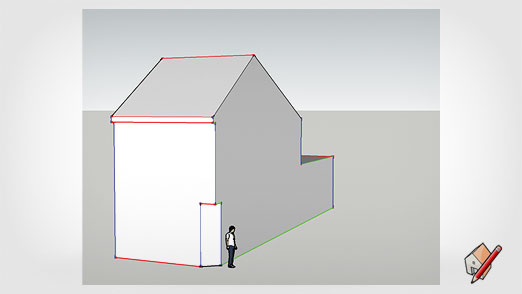
Getting the basic dimensions and shape of the building in Google’s SketchUp.

Sophie's Tavern SketchUp 2

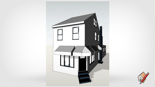
Adding the doors, windows, chimney, awnings, stairs and shading.

4. Mock Up

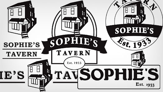
I took the building into Illustrator to turn it into a more simplified vector shape and applied it to some of the sketches/layouts from above.
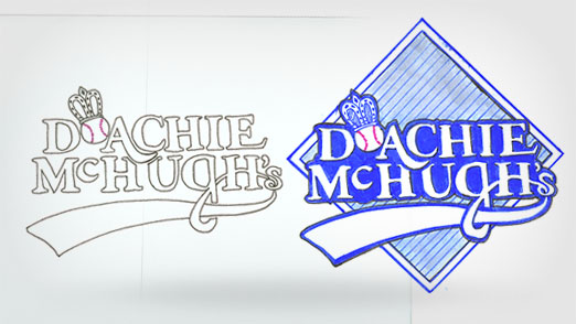
Sophie's Tavern Final Logo Design

5. Final

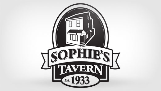
We all decided the mock up in the middle best suited our original goals of featuring the building and it’s history, and making it feel like a hometown, neighborhood bar. It still needed some work so I added some details to the text and cleaned it up a bit.

Sophie's Tavern Illustrator Mock Up

6. Conclusion

Concepting, sketching and deciding to use SketchUp proved once again that working through the entire creative/design process leads to great results. The black and white version of the logo will work great in any application; menus, signs, flyers, etc.