Hardee’s: For Love of Burgers, Type

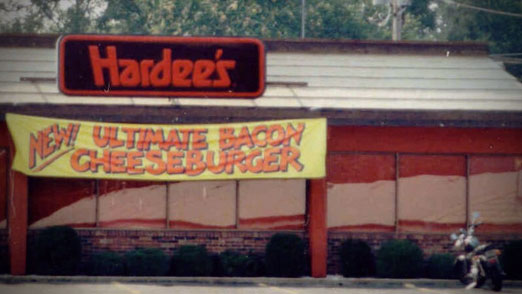
Hardee's Classic Logo Outside

My wife likes to remind me when we’re out to eat that there are other things on the menu besides cheeseburgers. What? I beg to differ.

I don’t know where my love of burgers comes from originally, but I do I remember going to Hardee’s on Millersville Pike as a kid vividly. (It’s not there anymore.) Specifically, I remember the first time I looked at the logo and realized the “a” and “e” were the same letter forms. I was so proud of myself. Let’s take a look at the logo below.
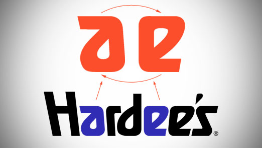
Hardee's Classic Logo Letter Forms

The shape is flipped 180 degrees and is actually a bit rounded out on the “e”.  The leading edge of the letter form is also angled slightly different but that’s because of the faux perspective they put on it. The angles would be off if it were not adjusted. So it’s not exactly the same shape, but close enough.

Sadly, Hardee’s is now Carl’s Jr. of which we have none, and the super text logo is gone in favor of a star and script. I’m not sure what about the star says “good burgers” but I wish the would have the opportunity to find out.
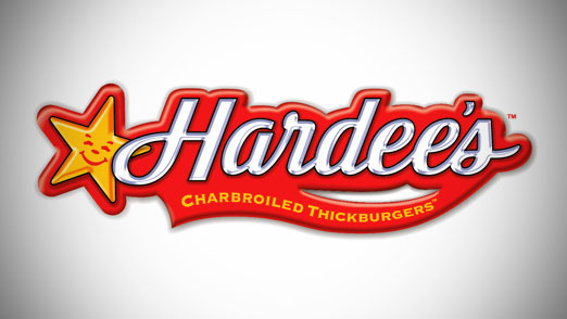
Hardee's & Carl's Jr. Updated Logo

You can read more about this logo over at Brand New by Under Consideration.
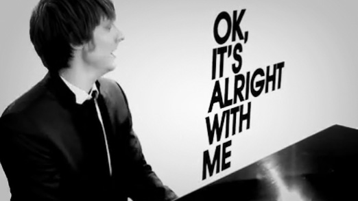
Large Type, It’s Alright With Me

Alright With Me - Eric Hutchinson

Another video featuring kinetic type, I know. But this one for Eric Hutchinson’s OK It’s Alright With Me is pretty sweet. The combination of the black and white with the moving type makes for a pretty simple yet effective video. Not to mention if you didn’t know the words before watching this video it won’t be long until you’re singing along. I picked this guy up a few times on Pandora and really enjoy his music.

Eric Hutchinson – OK, It’s Alright With Me

How to do Kinetic Type Tutorials

Watching this video got me thinking about how to do this kind of  thing and I remembered seeing a few really great video tutorials not that long ago over at the Envato site AETuts.com.  Check out the links below; there’s a pretty basic one they put together for Linkin Park’s Bleed It Out and a three-part video series to Bruce Lee’s Be Water speach.  Both excellent and easy to follow for anyone familiar with After Effects.

Design Rhythmic Motion Typography in After Effects

Create an Animated Homage to Bruce Lee – Day 1

Collection of Kinetic Type on the Web

The good people over at Web Designer Depot put together a nice collection of Typography in Motion. As a matter of fact they put together a nice little collection of 18 different examples including a great one from Zoolander.

18 Creative Examples of Typography in Motion