Identity for Wilkinson Remodeling

A good friend of mine remodels homes and runs his own company, Wilkinson Remodeling. As the company was growing he realized he needed an updated look. Nothing was wrong with his old logo (see below), but it was time to step up his identity to match the success of his business. He does great work, by the way, so if you are in the South East Pennsylvania area and are planning a project – hit him up.

Original Logo
Wilkinson Remodeling Original

1. Concept

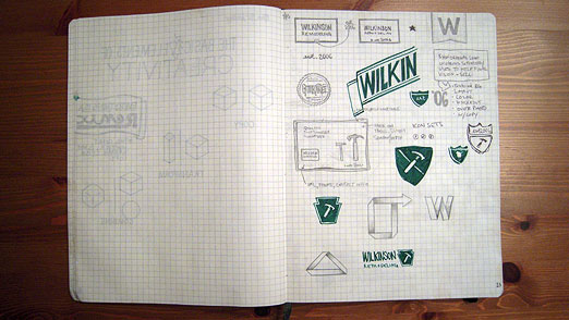
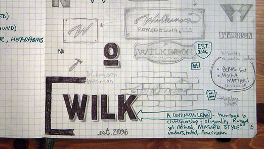
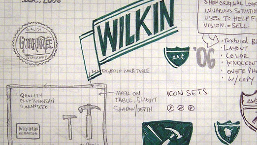
I had a few ideas from the beginning about how he could set himself apart from the competition. But what I really wanted to do for him was create something that said ‘Hey, I built this with my hands. And it’s better than anything you could buy from a big box store or get shopping in a catalog.’ Cause that’s the kind of work he does. So I went for this quality, handcrafted look – and I needed it to be about homes and construction. A Continuous Lean was a big inspiration, both the branding itself and the images, products and stories featured on the blog. So… here is my first round of sketches.

2. Sketches
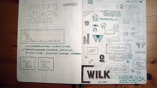
Wilkinson Remodeling Sketches 01

Wilkinson Remodeling Sketches 02

Wilkinson Remodeling Sketches 03

Wilkinson Remodeling Sketches 04

3. Early Concepts

Of course, as all good clients do – he had a few ideas of his own. I made some suggestions, provided some ideas and here is the first round of slightly refined logo concepts. The bottom middle happened to be my favorite. Perhaps it was a bit too rugged for the high-end homes he was working on. But man, it sure is true to what he does.
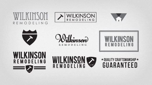
Wilkinson Remodeling Concepts

 4. Final

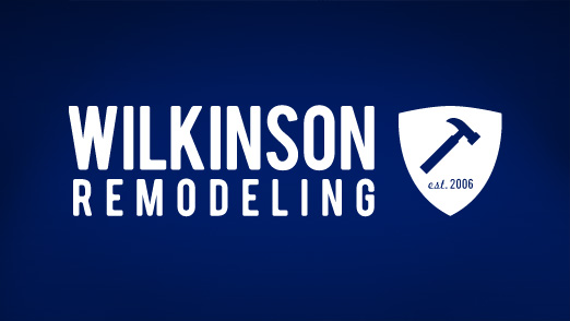
We decided on a combination of my favorite and a much less jagged version and landed on what you see below. We added in the shield to show some of the craftsman feel and make a nod to the founding date. Being around for more than 5 years in the home biz during a down market is quite impressive. I should also mention the logo makes use of the Bebas font which you can find over at Font Squirrel.
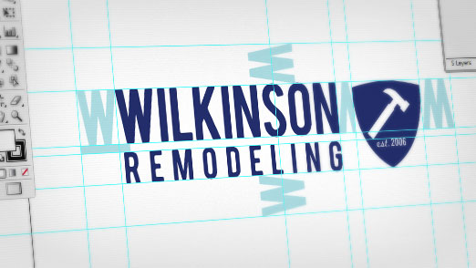
Wilkinson Remodeling Logo Illustrator

Final Wilkinson Remodeling logo.

Wilkinson Remodeling Logo

5. Bonus Content

I made some mock-ups of what the logo could look like in a series of small ads. I really like the whole look behind ‘Quality Craftsmanship Guaranteed’ that you can see in some of my sketches.
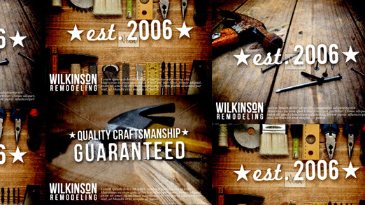
Wilkinson Remodeling Mock Ups

All in all, a great project and a great client. A strong identity that could have easily been just another construction company.
Logo Design for Vending Company

D&D Vending, LLC is a brand new, full-service vending machine company based in Coatesville, PA. They not only sell and distribute any and all vending machines (soda, snack, video) they also service them for you. Which is great, because the last thing you want to do is try and repair your snack machine yourself.

1. Concept

After speaking with D&D, it was clear they wanted one thing – something unique. They didn’t care so much if it was fancy and fresh or simple and straightforward. But one thing was for sure, they wanted it to be their own. And that is a great thing for a designer to hear because that means we are free to experiment a little bit.

2. Sketches

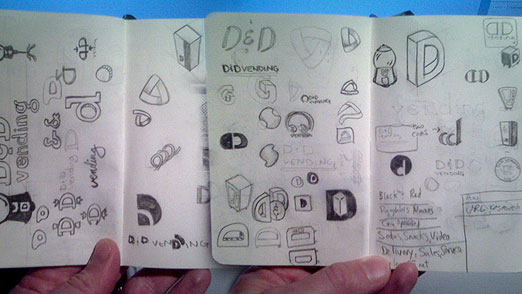
Back to the trusty Moleskine Plain Soft Notebook – Pocket size (buy):

D&D Vending Moleskine Sketches

3. Mock Up

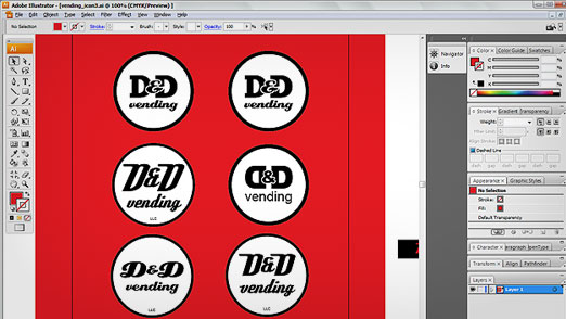
The circle logo was decided on for it’s similarity to a coin, the retro feel of the type, the simplicity of the initials and it’s flexibility.  Below are a few versions of the D&D in a circle.

Illustrator Sketches D&D Vending

4. Final

It wasn’t hard to decide on the retro font Deftone Stylus. You can find it over here at Font Squirrel, a great site. I adjusted the white space around the initials and fit everything into the circle a little cleaner.

D&D Vending, LLC logo

Here’s a detailed version on a red background:

D&D Vending, LLC - Detail

5. BONUS CONTENT!!!

Here’s a concept I was REALLY keen on. It’s based on a stylized version of a vending machine and transforms a logo into a character that really takes on the personality of the company. It developed after I was trying to draw a 3D perspective of a vending machine in Illustrator and I ended up with a wonderful mistake. It’s so unique it’s hard not to fall in love with it. I still think it has a lot of potential but for now he’ll just live on in my mind.
D&D Vending Alternate Logo Concept

In any case, developing a visual identity for D&D has been fun and I am already working on converting this into a complete identity including print and web.

Alternate Logo Designs for Citadel

Here’s a collection of alternate Citadel logos I’ve developed over the years. Citadel has a well established brand and it’s important to use that visual recognition when introducing a new concept, product or service pledge. In the various logos below I’ve carried over color, shape, font and feel to extend the original Citadel logo.  A few of them are subtle but each of them add new meaning and a unique twist.

1.

Citadel Class Service Logo

Citadel Class Service Customer service pledge

2.

Citadel TV Logo

Citadel TV In-house television network

3.

Citadel Safe, Sound, Secure Logo

Safe, Sound and Secure Logo designed in response to financial crisis

4.

Citadel Market Rate CD Logo

Market Rate CD Promotional product logo

5.

Citadel Switch Kit Logo

Switch Kit Logo for branded online bank account migration

Meghan’s Wedding Shower Invitation

There’s few events in life more important than your wedding. And Meghans’ friends certainly understood that when they were planning for her shower. They wanted something custom and not just something that you could add your name to online, but a one-of-a-kind invitation for a once-in-a-lifetime event.

1. Concept

I’ll readily admit, when it comes to things as girly as a wedding shower I have very few original ideas. Flowers, hearts, pink stuff and butterflies (see bonus image below) are all that come to mind. Good thing I got plenty of creative direction from the party planners. Thanks Kristi!

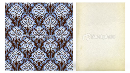
From the girls’ end, the invitation needed to be simple, pretty, elegant and unique. From the invitation’s standpoint, it needed to have all the regulars like who, what, when, where and why. Kristi found a great repeating floral pattern over at iStock and I have a great paper pattern from there I knew would come in handy as well.

iStock Images

You can get them on iStock here:
Pattern: http://www.istockphoto.com/file_closeup.php?id=8110112
Paper: http://www.istockphoto.com/file_closeup.php?id=3814039

2. Layout

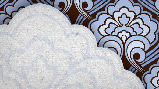
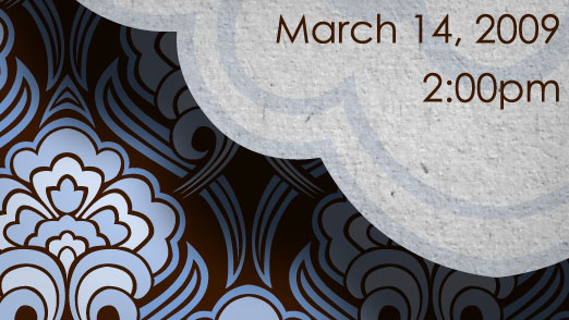
Using a great pattern like the one we have here allows us to keep a fairly basic layout. That will help us balance out the repeating floral that could be a little overwhelming if not kept in check by the rest of our design. I thought it would be interesting to isolate part of the pattern and layer it over top to create the base for our text and also add some depth with some slight shadows. The paper pattern was then laid over top of those pieces to give them a paper cutout feel and add to the handmade feel.

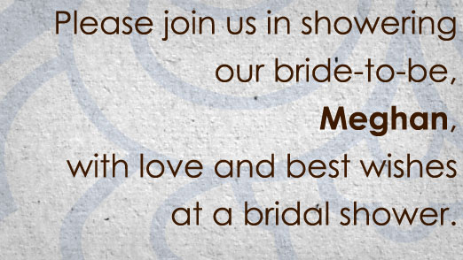
Meghan's Invitation Detail 1

Meghan's Invitation Detail 2

Meghan's Invitation Detail 3

3. Final

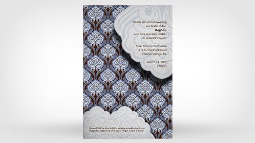
What I really like about this invitation is that it turned out not being so girly after all. It does have a nice feminine feel but the blues and browns keep it from going over the top and prevent it from being very cliché.

Meghan's Invitation Final

4. BONUS CONTENT!!!

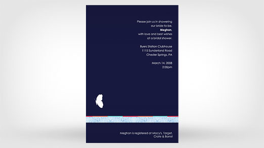
When I was pulling together some stuff for the site I came across this earlier version of the invite.

Meghan's Invitation Alternate

You can see the basic layout stayed the same but the solid blue background and butterfly are quite different from the end result. I think the pattern, texture and depth in the final invitation give it that real customized feel we were after. And I’m pretty sure Meghan and the girls had a great time at the shower!

Promotional Poster for Citadel

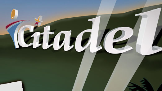
Citadel needed a way to impressively introduce its new line of checking accounts aptly named the STAR family. And everyone knows, if you’re looking for a real star, you’re going to find it in Hollywood. I had a general concept in mind for the poster that included replacing the famous ‘Hollywood’ sign with the Citadel logo, using a red carpet and throwing the whole thing up in lights.

1. Concept

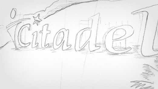
A Hollywood premiere for something quite commonly very un-Hollywood. That was the approach to introducing a new product line and creating some “sizzle ” for the brand. I found a great stock illustration at iStock to start my design and then did a nice pencil drawing to get the basic layout and think through some of the major elements.
Hollywood Pencil Sketch Detail
Pencil sketch detail of the Hollywood sign being replaced the Citadel logo.
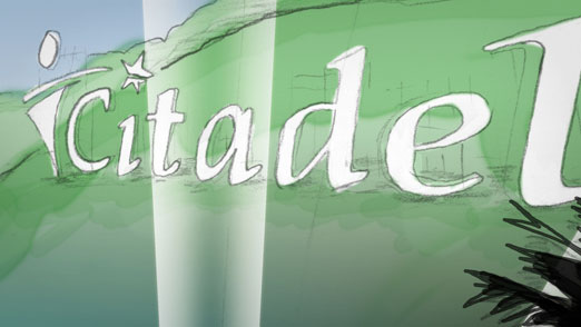
Hollywood Color Sketch Detail

Colored in detail of the new Citadel sign.

2. Mock Up

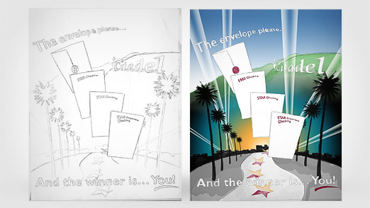
I like to use a sketch to get the layout and afterward quickly put some color in to get a feel for the entire look. In this project, I scanned in the original sketch and used Photoshop to add the color on a separate layer. I used a watercolor brush to keep the same raw feel of the sketch.
Hollywood Sketch Full Comparison

Side-by-side view of the original pencil sketch and the colored version.

3. Final

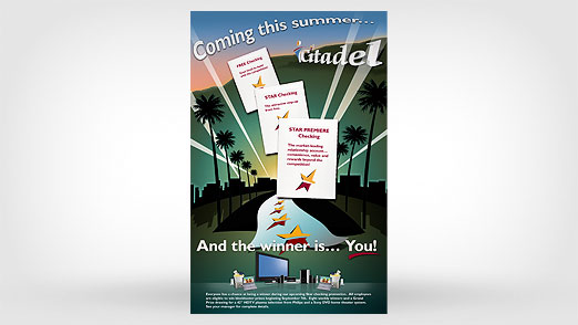
After I had the final colored version of the layout, some minor adjustments were made to the copy and concept. The headline was changed and the number of elements in the middle was reduced to three. Also, a collage of electronic items was added to the bottom to show some of the swag they were giving away in announcing the new accounts. I recreated the Hollywood sign in Illustrator using the 3D Extrude and Bevel combined with a warp effect to get a vector version to use  in the final rendering.
Hollywood Final Detail

Detailed view of the Citadel sign from the completed poster.

4. Conclusion

The poster has been cleaned up and completely rendered out in Illustrator and then transferred over to Photoshop to add the finishing touches.
Hollywood Final Full

The Citadel Star Checking accounts were very successful in aqcuiring new accounts thanks  to the buzz created from these great posters. The design was printed in several formats and the layout altered slightly depending on the situation.

Logo Design for Doachie McHugh’s

A bar. An Irish bar. An Irish bar that loves the Phillies.

An Irish bar that loves the Phillies and needs a logo?

Talk about a dream job! The combination of those four magical things led to the development of the Doachie McHugh’s bar logo. Let’s walk through the process of creating a logo from start to finish to get a feel for the entire creative process from initial concept sketch to finished logo.

1. Concept

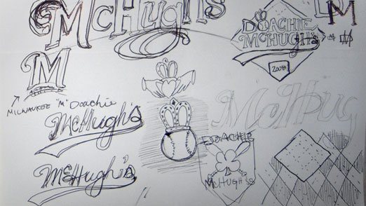
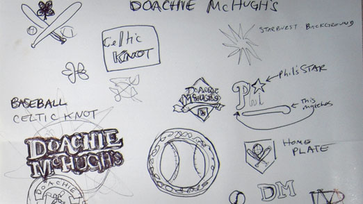
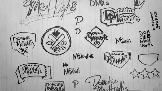
The concept is an Irish bar who loves the Philadelphia Phillies. Simple enough. Let’s get started with some rough sketches. This hand drawn step is very important to get a lot of ideas out quickly and to get an idea of what looks best on paper before you sit down at a computer. The more the merrier, so here’s a sample of the concepts I sketched out for Doachie McHugh’s.

Doachie McHugh's Sketch 1
You can see the traditional Irish claddagh in the sketch above and the eventual Phillie-esque shapes start to come alive .
Doachie McHugh's Sketch 2
Some of the type and outlining is starting to come alive here.
Doachie McHugh's Sketch 3
Some explorations of the home plate shape to outline the logo and incorporate the baseball theme.

2. Sketches

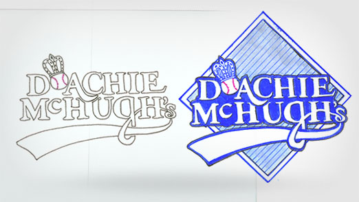
After seeing some initial thoughts come to life and sharing them with the client, it’s time to give the best concepts a little more thought. At this point I like to move from pencil/pen/sharpie into pencil/color marker mock up. The crown from the claddagh was chosen along with the baseball for the letter “O” and a base for the outlining shape.
Doachie McHugh's Marker Sketch 4

3. Mock Up

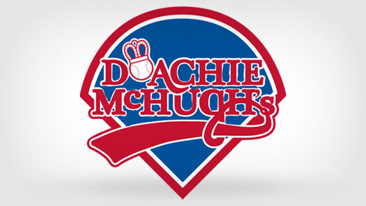
After sharing the color markup sketches with the client some final decisions are made. Make it more like the Phillies logo, use the rounded top home plate shape and add some more color, like blue and red!
Doachie McHugh's Photoshop Sketch

4. Final

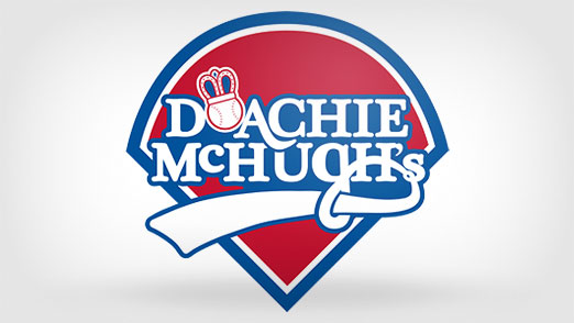
Some final color selections have been made and we have a completed logo. This is the point where I take the sketches and scans and move them into Photoshop and then later Illustrator to add the polish.
Doachie McHugh's Sketch 6

5.Conclusion

You can see how important it is to work through this process from sketch to completion based on the final rendering. I’ll readily admit that I don’t do this on every project due to time or budget… but I’m always much more satisfied with results when I do!

Logo Design for Sophie’s Tavern

Sophie’s Tavern has been located in the heart of Camden, NJ since they first opened their doors in 1933. It wasn’t until they recently renovated the building that they actually thought about having an official logo.

1. Concept

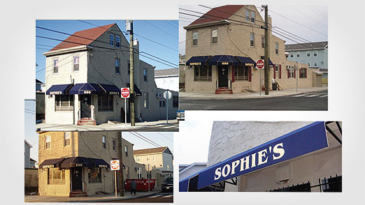
Sophie’s wanted something that reflected the building since it has remained largely untouched through the years and is very visible in the community. It is also one of the few remaining original buildings as Camden is undergoing a larger revitalization process and will help reflect the history of the tavern. Other than that, they wanted a pretty hometown feel for a local watering hole that everyone loves going to.
Sophie's Tavern Images

A few images of Sophies Tavern to work from.

2. Sketches

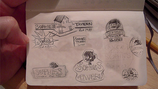
I did  a few quick sketches and sent them to the folks over at Sophie’s Tavern to get there opinion.  I did a few “classic” bar and beer label layouts to get a feel of how the building was going to interact with the text andwhat the overall shape was going to be.

Sophie's Tavern Sketches

Sketches from my trusty Moleskine.

3. SketchUp

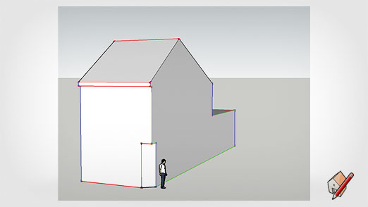
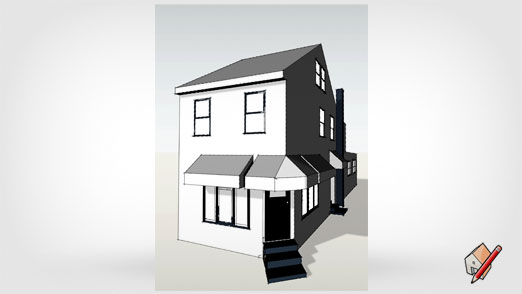
Since the building was going to be so important to the logo I really wanted it be accurate.  And since I had never actually been to Sophie’s Tavern myself, I decided to rebuild it from the pictures using Google’s free SketchUp 3D drawing program.  This was a first for me but I wanted to challenge myself to do something new and learn a new program at the same time.  (There are some great tutorials for SketchUp all over the web, especially YouTube.)

Sophie's Tavern SketchUp 1

Getting the basic dimensions and shape of the building in Google’s SketchUp.

Sophie's Tavern SketchUp 2

Adding the doors, windows, chimney, awnings, stairs and shading.

4. Mock Up

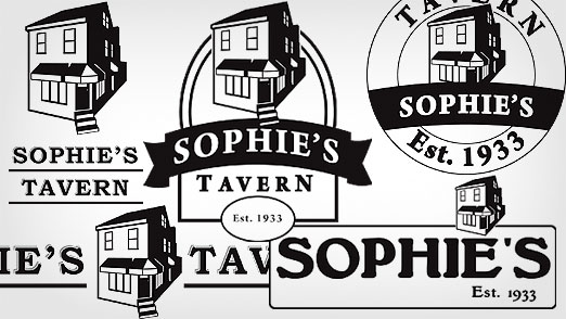
I took the building into Illustrator to turn it into a more simplified vector shape and applied it to some of the sketches/layouts from above.

Sophie's Tavern Final Logo Design

5. Final

We all decided the mock up in the middle best suited our original goals of featuring the building and it’s history, and making it feel like a hometown, neighborhood bar. It still needed some work so I added some details to the text and cleaned it up a bit.

Sophie's Tavern Illustrator Mock Up

6. Conclusion

Concepting, sketching and deciding to use SketchUp proved once again that working through the entire creative/design process leads to great results. The black and white version of the logo will work great in any application; menus, signs, flyers, etc.