Over-the-Hill Beer Labels
Over-the-hill Beer Labels

Personal Project: Beer Bottle Relabeling

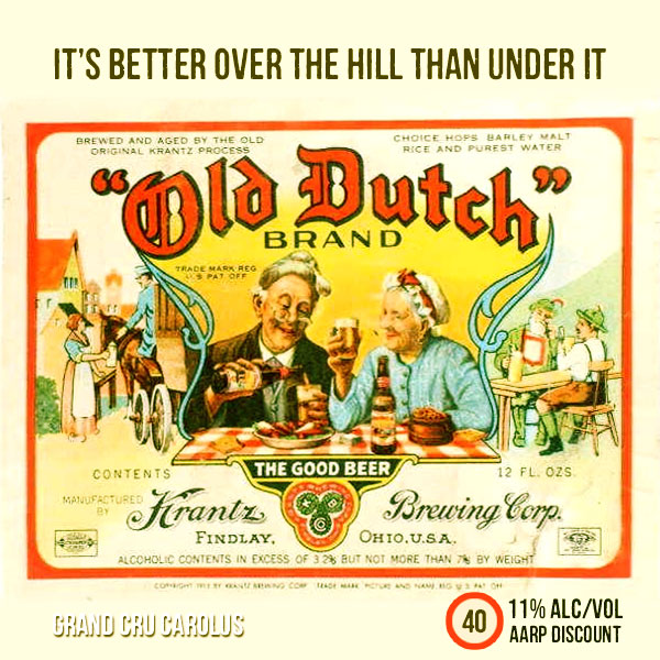
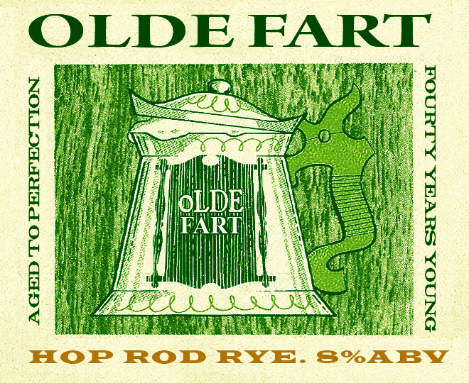
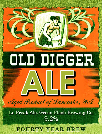
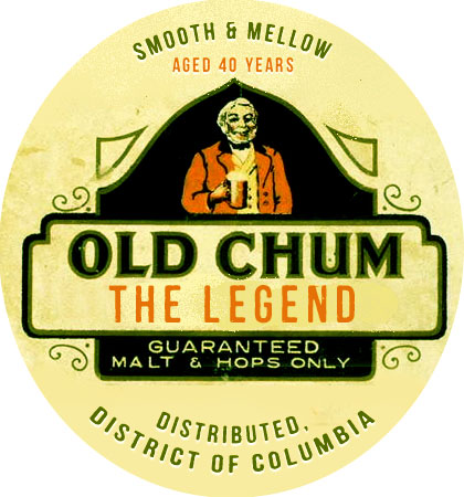
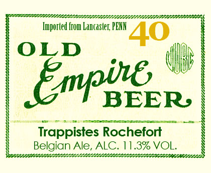
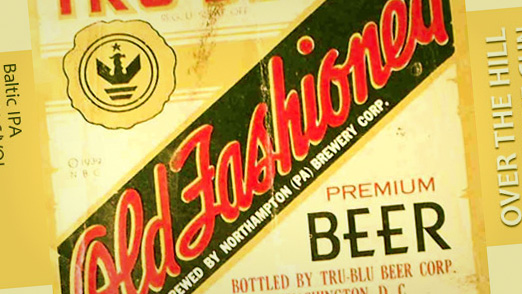
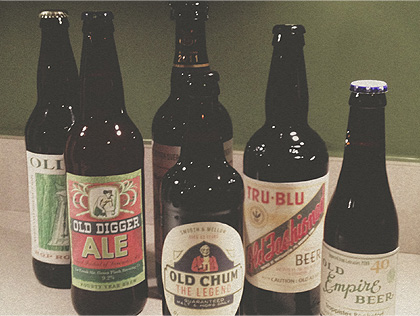
My brother just turned 40 so I made him some over-the-hill OLD-inspired labels to replace the real ones on a few fairly nice brews I picked up for him. I didn’t feel like wasting money on a gag gift, but wanted to get him at least a little something to remind him how old he is getting. I started with a Google search and found plenty of source material. A few minutes in Photoshop on each one replacing and adding text where appropriate and the final result turned out fantastic. I removed the original beer labels by soaking them in water for about 10-15 minutes and then peeling them off. To attach the new beer labels I used some double-sided tape which worked perfectly to keep them nice and smooth on the bottle. This was a real easy way to add a personal touch to gift. I’m thinking about doing this for more people as the holiday season approaches.

Check them all out here.
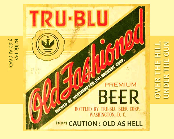
And the final result:
Work in Progress: Logo Development

Siousca Branding Logo Development

Siousca Photography Branding Sketches

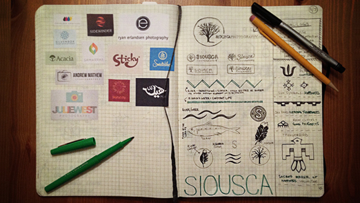
I’ve been working on some branding for an awesome photographer and good friend of mine Dave Waddell of Siousca Photography. I thought I’d share a quick sneak peek of the research and progress so far from my trusty Moleskine. You can see some inspiration on the left, the original logo on the top of the right hand page and a bunch of concepts following that. Siousca is the Native American term for the land around the Brandywine river which is where Dave grew up. So there is definitely a bend towards that.

Hopefully, I’ll be wrapping this up soon, as I know Dave is patiently waiting. I’ll be sure to post some more on this one as it has been a blast to work on. In the meantime, if you need a photographer for weddings, engagements or family photos, check Dave out.

Identity for Wilkinson Remodeling

A good friend of mine remodels homes and runs his own company, Wilkinson Remodeling. As the company was growing he realized he needed an updated look. Nothing was wrong with his old logo (see below), but it was time to step up his identity to match the success of his business. He does great work, by the way, so if you are in the South East Pennsylvania area and are planning a project – hit him up.

Original Logo

Wilkinson Remodeling Original

1. Concept

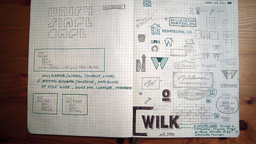
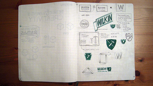
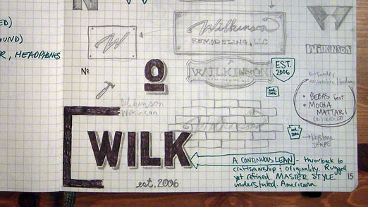
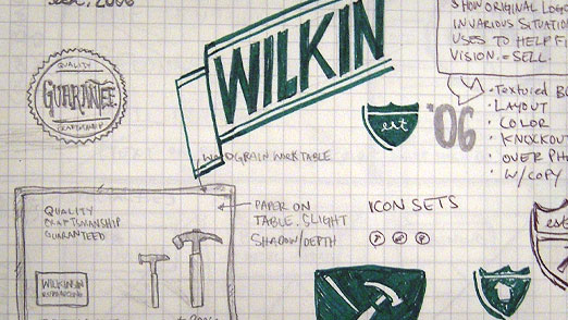
I had a few ideas from the beginning about how he could set himself apart from the competition. But what I really wanted to do for him was create something that said ‘Hey, I built this with my hands. And it’s better than anything you could buy from a big box store or get shopping in a catalog.’ Cause that’s the kind of work he does. So I went for this quality, handcrafted look – and I needed it to be about homes and construction. A Continuous Lean was a big inspiration, both the branding itself and the images, products and stories featured on the blog. So… here is my first round of sketches.

2. Sketches

Wilkinson Remodeling Sketches 01

Wilkinson Remodeling Sketches 02

Wilkinson Remodeling Sketches 03

Wilkinson Remodeling Sketches 04

3. Early Concepts

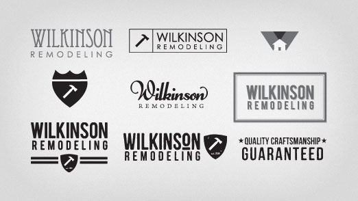
Of course, as all good clients do – he had a few ideas of his own. I made some suggestions, provided some ideas and here is the first round of slightly refined logo concepts. The bottom middle happened to be my favorite. Perhaps it was a bit too rugged for the high-end homes he was working on. But man, it sure is true to what he does.

Wilkinson Remodeling Concepts

 4. Final

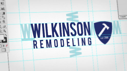
We decided on a combination of my favorite and a much less jagged version and landed on what you see below. We added in the shield to show some of the craftsman feel and make a nod to the founding date. Being around for more than 5 years in the home biz during a down market is quite impressive. I should also mention the logo makes use of the Bebas font which you can find over at Font Squirrel.

Wilkinson Remodeling Logo Illustrator

Final Wilkinson Remodeling logo.

Wilkinson Remodeling Logo

5. Bonus Content

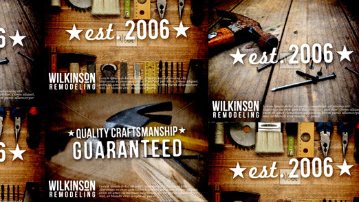
I made some mock-ups of what the logo could look like in a series of small ads. I really like the whole look behind ‘Quality Craftsmanship Guaranteed’ that you can see in some of my sketches.

Wilkinson Remodeling Mock Ups

All in all, a great project and a great client. A strong identity that could have easily been just another construction company.

Birthday Doodle from Google

Birthday Doodle from Google

Happy Birthday Doodle from Google

Well, today is my birthday. And doesn’t Google know it. To some people it may seem scary that someone, or some thing knows so much about you. But this little Google Doodle for MY birthday is such a nice little touch, I don’t think anybody would mind seeing this.

It’s All in the Details

The birthday doodle is really cool, but what seals the deal for me is the Alt Text. Hover over the doodle and it says “Happy Birthday Kevin!” I know it’s a minor detail, an aside, something that not everyone will even notice. But it shows us two things:

  1. Google is focused on the details of all of their projects, right down to the final execution.
  2. The people who coded this little doodle know that there are just a handful of people who WILL notice the Alt Text and that those people (myself included) will really appreciate it. It takes extra time, extra effort, but it was able to float up the chain for someone to say yes. And it made it in.

Thank you, Googlers!

Google Doodle Features Animation

Google Doodle Animation

Father of Gravity Makes Doodle Move

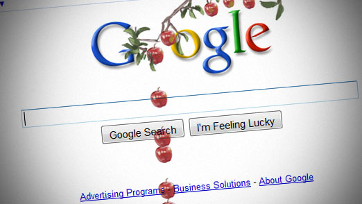
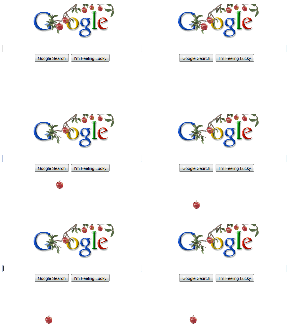
In honor of Sir Isaac Newton’s birthday, Google introduces the first Doodle to use animation. It seems fitting that Google used JavaScript instead of Flash or an Animated GIF to produce the effect. That would have been like cheating. Instead, they created a simple equation to help “explain” why the apple falls. Just as Newton helped explain the Universal Law of Gravitation through a calculus-like method of geometrical analysis, Google uses an interval function to make the apple drop.

Sir Isaac Newton, an English physicist, mathematician, astronomer, natural philosopher, alchemist and theologian is generally regarded as one of the most influential scientists in history. I’m not sure how he found the time to do all of that, but he he also found time to write the Philosophiæ Naturalis Principia Mathematica (Mathematical Principles of Natural Philosophy). One of the most influential books in scientific history.

Google Doodle Drop

Image from Amit Agarwal

Logo Design for Vending Company

D&D Vending, LLC is a brand new, full-service vending machine company based in Coatesville, PA. They not only sell and distribute any and all vending machines (soda, snack, video) they also service them for you. Which is great, because the last thing you want to do is try and repair your snack machine yourself.

1. Concept

After speaking with D&D, it was clear they wanted one thing – something unique. They didn’t care so much if it was fancy and fresh or simple and straightforward. But one thing was for sure, they wanted it to be their own. And that is a great thing for a designer to hear because that means we are free to experiment a little bit.

2. Sketches

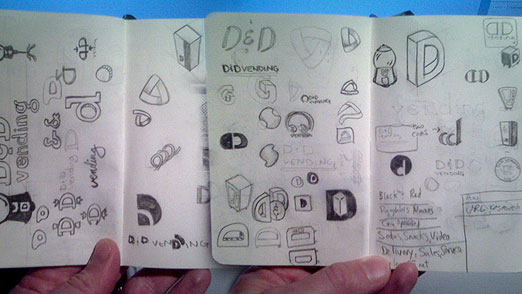
Back to the trusty Moleskine Plain Soft Notebook – Pocket size (buy):

D&D Vending Moleskine Sketches

3. Mock Up

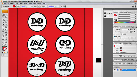
The circle logo was decided on for it’s similarity to a coin, the retro feel of the type, the simplicity of the initials and it’s flexibility.  Below are a few versions of the D&D in a circle.

Illustrator Sketches D&D Vending

4. Final

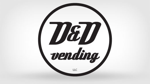
It wasn’t hard to decide on the retro font Deftone Stylus. You can find it over here at Font Squirrel, a great site. I adjusted the white space around the initials and fit everything into the circle a little cleaner.

D&D Vending, LLC logo

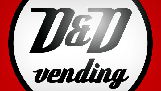
Here’s a detailed version on a red background:

D&D Vending, LLC - Detail

5. BONUS CONTENT!!!

Here’s a concept I was REALLY keen on. It’s based on a stylized version of a vending machine and transforms a logo into a character that really takes on the personality of the company. It developed after I was trying to draw a 3D perspective of a vending machine in Illustrator and I ended up with a wonderful mistake. It’s so unique it’s hard not to fall in love with it. I still think it has a lot of potential but for now he’ll just live on in my mind.

D&D Vending Alternate Logo Concept

In any case, developing a visual identity for D&D has been fun and I am already working on converting this into a complete identity including print and web.

Tiger, Obama, Get Body Doubles

kohara_barack_obama_tiger_woods

Cheer Up, Mr President

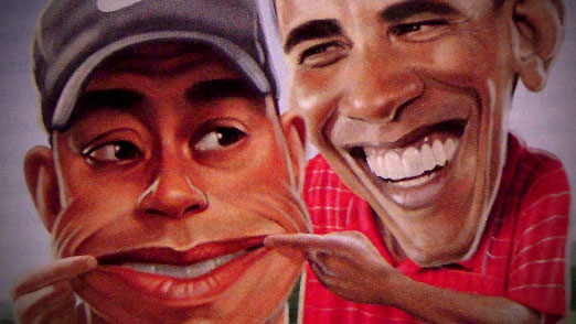
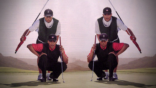
I received my January 2010 issue of Golf Digest yesterday and imagine my suprise to see the cover story “10 Tips Obama can take from Tiger”. I’m not going into the whole story, you can find that here, here and even more here. But I do have one question… which is worse? The fact they put the controversial Woods on the cover only two weeks he hit the news or the fact that Golf Digest used such poor PhotoShop work on their cover. If it wasn’t obvious to everyone else, both the heads of Obama and Tiger have been cut and paste onto new bodies in Photoshop. In a very bad way. I don’t know know if you’ve seen either one of them lately but I don’t think they need body doubles.

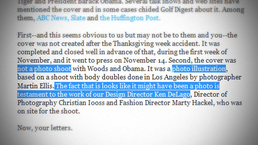
Photo Illustration

The funny part is that it got mentioned by Golf Digest as a “photo illustration”. Read below:

Tiger Woods Golf Digest Cover

Personally, I think the illustrations, like the one you see at the top of this page are waaaay better than the Tiger/Obama mashup.

Tiger, Obama, Get Body Doubles

Check out more of the coverage over at Golf Digest.

Google Fade In – Search Page Effects

Google Fade In

Google Interface Changes

If you’ve been to Google lately, and I’m sure you have, you might notice the slight fade in effect of the home page. On loading the page, the web page is missing quite a few of the usual links, titles, buttons and other options. You can type your search terms and keywords in the search field and press enter to search or if your mouse enters the page the other fields will show.  Everything “fades” in and gives you a nice visual instead of abruptly pooping onto the page.

I have read that it is causing a bit of confusion among users. I have to admit, when I first notice the effect I thought that my system was hung up or the page stopped loading. I thought was odd being that it’s Google, and I don’t recall a time that they were ever down. Also, some users may not be seeing this because it is based off of browser and system. I don’t know whether Google is rolling this out or just testing it. It may be a Google Labs project but I’m assuming that it will make it’s way past that and be part of the regular page.  They don’t make too many changes to the interface and if it’s made it this far to the public, you can be certain that Google is behind this 100% and only a major backlash from the web community would kill the new feature.

See The Google Fade In Live

Here’s a video of the effect if you aren’t seeing it on your computer:

I am getting used to this visual effect and actually like it. But that may be because I like to keep things simple.  One thing I was thinking would be to keep it empty until you type your search terms and then provide butttons to search based on your needs. So instead of pressing the “Google Search” button, you would press the “Web Search”, “Image Search” “Video Search”, “Blog Search”, etc. buttons. That would limit the need to switch search engines and thus eliminate one more unncessary click.

Hardee’s: For Love of Burgers, Type

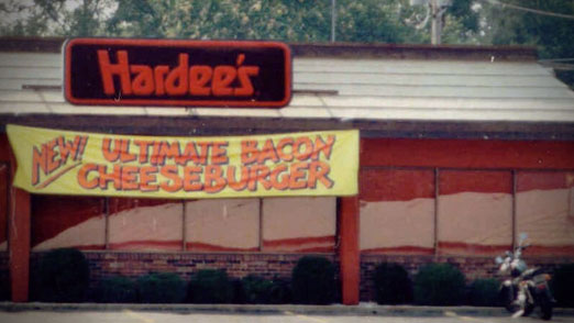
Hardee's Classic Logo Outside

My wife likes to remind me when we’re out to eat that there are other things on the menu besides cheeseburgers. What? I beg to differ.

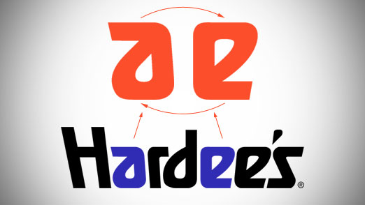
I don’t know where my love of burgers comes from originally, but I do I remember going to Hardee’s on Millersville Pike as a kid vividly. (It’s not there anymore.) Specifically, I remember the first time I looked at the logo and realized the “a” and “e” were the same letter forms. I was so proud of myself. Let’s take a look at the logo below.

Hardee's Classic Logo Letter Forms

The shape is flipped 180 degrees and is actually a bit rounded out on the “e”.  The leading edge of the letter form is also angled slightly different but that’s because of the faux perspective they put on it. The angles would be off if it were not adjusted. So it’s not exactly the same shape, but close enough.

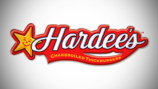
Sadly, Hardee’s is now Carl’s Jr. of which we have none, and the super text logo is gone in favor of a star and script. I’m not sure what about the star says “good burgers” but I wish the would have the opportunity to find out.

Hardee's & Carl's Jr. Updated Logo

You can read more about this logo over at Brand New by Under Consideration.

PhotoSketch: Instant Comps, Photoshop Not Required

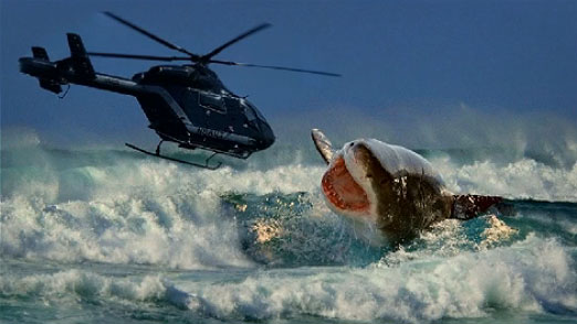
PhotoSketch Shark Attacks Helicopter

Q: PhotoSketch: Is it real or is it fake?

A: Who cares?

In case you haven’t heard, Photosketch is program that seamlessly stitches several different photographs (found on the internet) into one final image based on a simple sketch with notes. It is brought to you by the brains of five super-computer Chinese technology students at Tsinghua University. The idea is that anyone can do a basic drawing to provide the concept and that PhotoSketch will pump out a picture worthy of sharing with your coworkers to get approval.

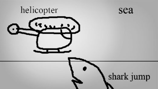
The key here is that it is done to provide slightly better than stick figure drawings to help get your point across without having to waste time and energy creating mock-ups, marker comps, cut & pastes or other methods often used in the conceptual phase. The image above was supposedly created from the sketch below. Awesome, right?

PhotoSketch Concept

The Future of Digital Imaging

At this point, PhotoSketch is most likely a pipe-dream “Look what we wish we could do with technology” project than something you could actually begin to use anytime soon. Even if it were available imediately with all the features it boasts, designers shouldn’t be as nervous as some would suggest. Tools will come and go, but knowledge can never be replaced.

As a designer myself, I would use PhotoSketch as a quick concept tool before I ever even opened PhotoShop. It’s just easy, plain and simple.  Take a look for yourself:

PhotoSketch: Internet Image Montage from tao chen on Vimeo.

You can also read more about it and see what other people are saying over at Mashable.