Alternate Logo Designs for Citadel

Here’s a collection of alternate Citadel logos I’ve developed over the years. Citadel has a well established brand and it’s important to use that visual recognition when introducing a new concept, product or service pledge. In the various logos below I’ve carried over color, shape, font and feel to extend the original Citadel logo.  A few of them are subtle but each of them add new meaning and a unique twist.

1.

Citadel Class Service Logo

Citadel Class Service Customer service pledge

2.

Citadel TV Logo

Citadel TV In-house television network

3.

Citadel Safe, Sound, Secure Logo

Safe, Sound and Secure Logo designed in response to financial crisis

4.

Citadel Market Rate CD Logo

Market Rate CD Promotional product logo

5.

Citadel Switch Kit Logo

Switch Kit Logo for branded online bank account migration

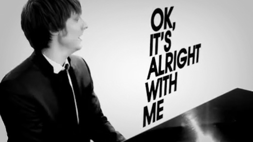
Large Type, It’s Alright With Me

Alright With Me - Eric Hutchinson

Another video featuring kinetic type, I know. But this one for Eric Hutchinson’s OK It’s Alright With Me is pretty sweet. The combination of the black and white with the moving type makes for a pretty simple yet effective video. Not to mention if you didn’t know the words before watching this video it won’t be long until you’re singing along. I picked this guy up a few times on Pandora and really enjoy his music.

Eric Hutchinson – OK, It’s Alright With Me

How to do Kinetic Type Tutorials

Watching this video got me thinking about how to do this kind of  thing and I remembered seeing a few really great video tutorials not that long ago over at the Envato site AETuts.com.  Check out the links below; there’s a pretty basic one they put together for Linkin Park’s Bleed It Out and a three-part video series to Bruce Lee’s Be Water speach.  Both excellent and easy to follow for anyone familiar with After Effects.

Design Rhythmic Motion Typography in After Effects

Create an Animated Homage to Bruce Lee – Day 1

Collection of Kinetic Type on the Web

The good people over at Web Designer Depot put together a nice collection of Typography in Motion. As a matter of fact they put together a nice little collection of 18 different examples including a great one from Zoolander.

18 Creative Examples of Typography in Motion

The Color of Going Green: New AIGA Membership Cards

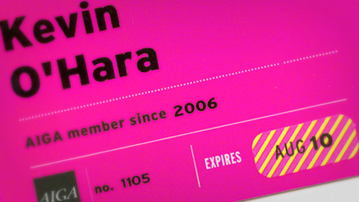
New AIGA Membershp Cards

I just got my my new AIGA membership card in the mail the other day and was excited to see the one pictured above. AIGA decided to stop sending out new cards every year and will instead issue new expiration date stickers upon renewal. This will considerably cut down on the amount of plastic they produce and is a strong commitment to sustainable design.

Aside from the fact that the cards are reducing waste, they are designed very well. The one I received is a nice magenta, but I believe that they also come in cyan and yellow. A nice tribute to CMYK and the history of the association. I’m sure they decided that it was about time designers had membership cards that were actually designed well. Thanks AIGA!

Visit AIGA online

****UPDATE 9/11/2010****

Time for my annual membership renewal and sure enough… a nice little striped sticker for my AIGA membership card with the new expiration date arrived in the mail. Thanks, AIGA!

Meghan’s Wedding Shower Invitation

There’s few events in life more important than your wedding. And Meghans’ friends certainly understood that when they were planning for her shower. They wanted something custom and not just something that you could add your name to online, but a one-of-a-kind invitation for a once-in-a-lifetime event.

1. Concept

I’ll readily admit, when it comes to things as girly as a wedding shower I have very few original ideas. Flowers, hearts, pink stuff and butterflies (see bonus image below) are all that come to mind. Good thing I got plenty of creative direction from the party planners. Thanks Kristi!

From the girls’ end, the invitation needed to be simple, pretty, elegant and unique. From the invitation’s standpoint, it needed to have all the regulars like who, what, when, where and why. Kristi found a great repeating floral pattern over at iStock and I have a great paper pattern from there I knew would come in handy as well.

iStock Images

You can get them on iStock here:
Pattern: http://www.istockphoto.com/file_closeup.php?id=8110112
Paper: http://www.istockphoto.com/file_closeup.php?id=3814039

2. Layout

Using a great pattern like the one we have here allows us to keep a fairly basic layout. That will help us balance out the repeating floral that could be a little overwhelming if not kept in check by the rest of our design. I thought it would be interesting to isolate part of the pattern and layer it over top to create the base for our text and also add some depth with some slight shadows. The paper pattern was then laid over top of those pieces to give them a paper cutout feel and add to the handmade feel.

Meghan's Invitation Detail 1

Meghan's Invitation Detail 2

Meghan's Invitation Detail 3

3. Final

What I really like about this invitation is that it turned out not being so girly after all. It does have a nice feminine feel but the blues and browns keep it from going over the top and prevent it from being very cliché.

Meghan's Invitation Final

4. BONUS CONTENT!!!

When I was pulling together some stuff for the site I came across this earlier version of the invite.

Meghan's Invitation Alternate

You can see the basic layout stayed the same but the solid blue background and butterfly are quite different from the end result. I think the pattern, texture and depth in the final invitation give it that real customized feel we were after. And I’m pretty sure Meghan and the girls had a great time at the shower!

What You Can Expect From this Blog

Expectations play a huge role in the success of a good brand.  And the same holds true for blogs.  Readers want relevant posts related to the topics the site covers. Since this blog is brand new I figured it would be a good idea to let everyone know exactly what they are in for before they grab the RSS feed or sign up for the email list.

At some point I will work up a “Making of the Blog” behind-the-scenes post, but for now I’ll tell you what you should be expecting from this site. This website is my personal home on the web. It contains my portfolio of freelance projects as a graphic and web designer, my professional portfolio and resume, and my blog. The blog is a new project and my focus is to write. I’ll write when I don’t have anything to write about. I’ll write when I have other things to do. I’ll even write when I don’t want to. But I will write!

What I Will be Blogging About

I will be blogging about anything and everything that is important to me.  Hopefully, over time, we’ll begin to discover that we have the same interests.  Things that you’ll read about on this blog are Graphic Design, Web Design, Tutorials, Social Media, Business/Small Business, Marketing,  Start-Ups, Entrepreneurs, Drawing, Painting and Photography.

I hope you continue to follow along and share your own stories about blogging and starting out on the web. If you’re new at blogging too, I’d love to hear from you.

Promotional Poster for Citadel

Citadel needed a way to impressively introduce its new line of checking accounts aptly named the STAR family. And everyone knows, if you’re looking for a real star, you’re going to find it in Hollywood. I had a general concept in mind for the poster that included replacing the famous ‘Hollywood’ sign with the Citadel logo, using a red carpet and throwing the whole thing up in lights.

1. Concept

A Hollywood premiere for something quite commonly very un-Hollywood. That was the approach to introducing a new product line and creating some “sizzle ” for the brand. I found a great stock illustration at iStock to start my design and then did a nice pencil drawing to get the basic layout and think through some of the major elements.
Hollywood Pencil Sketch Detail
Pencil sketch detail of the Hollywood sign being replaced the Citadel logo.
Hollywood Color Sketch Detail

Colored in detail of the new Citadel sign.

2. Mock Up

I like to use a sketch to get the layout and afterward quickly put some color in to get a feel for the entire look. In this project, I scanned in the original sketch and used Photoshop to add the color on a separate layer. I used a watercolor brush to keep the same raw feel of the sketch.
Hollywood Sketch Full Comparison

Side-by-side view of the original pencil sketch and the colored version.

3. Final

After I had the final colored version of the layout, some minor adjustments were made to the copy and concept. The headline was changed and the number of elements in the middle was reduced to three. Also, a collage of electronic items was added to the bottom to show some of the swag they were giving away in announcing the new accounts. I recreated the Hollywood sign in Illustrator using the 3D Extrude and Bevel combined with a warp effect to get a vector version to use  in the final rendering.
Hollywood Final Detail

Detailed view of the Citadel sign from the completed poster.

4. Conclusion

The poster has been cleaned up and completely rendered out in Illustrator and then transferred over to Photoshop to add the finishing touches.
Hollywood Final Full

The Citadel Star Checking accounts were very successful in aqcuiring new accounts thanks  to the buzz created from these great posters. The design was printed in several formats and the layout altered slightly depending on the situation.

Logo Design for Doachie McHugh’s

A bar. An Irish bar. An Irish bar that loves the Phillies.

An Irish bar that loves the Phillies and needs a logo?

Talk about a dream job! The combination of those four magical things led to the development of the Doachie McHugh’s bar logo. Let’s walk through the process of creating a logo from start to finish to get a feel for the entire creative process from initial concept sketch to finished logo.

1. Concept

The concept is an Irish bar who loves the Philadelphia Phillies. Simple enough. Let’s get started with some rough sketches. This hand drawn step is very important to get a lot of ideas out quickly and to get an idea of what looks best on paper before you sit down at a computer. The more the merrier, so here’s a sample of the concepts I sketched out for Doachie McHugh’s.

Doachie McHugh's Sketch 1
You can see the traditional Irish claddagh in the sketch above and the eventual Phillie-esque shapes start to come alive .
Doachie McHugh's Sketch 2
Some of the type and outlining is starting to come alive here.
Doachie McHugh's Sketch 3
Some explorations of the home plate shape to outline the logo and incorporate the baseball theme.

2. Sketches

After seeing some initial thoughts come to life and sharing them with the client, it’s time to give the best concepts a little more thought. At this point I like to move from pencil/pen/sharpie into pencil/color marker mock up. The crown from the claddagh was chosen along with the baseball for the letter “O” and a base for the outlining shape.
Doachie McHugh's Marker Sketch 4

3. Mock Up

After sharing the color markup sketches with the client some final decisions are made. Make it more like the Phillies logo, use the rounded top home plate shape and add some more color, like blue and red!
Doachie McHugh's Photoshop Sketch

4. Final

Some final color selections have been made and we have a completed logo. This is the point where I take the sketches and scans and move them into Photoshop and then later Illustrator to add the polish.
Doachie McHugh's Sketch 6

5.Conclusion

You can see how important it is to work through this process from sketch to completion based on the final rendering. I’ll readily admit that I don’t do this on every project due to time or budget… but I’m always much more satisfied with results when I do!

Logo Design for Sophie’s Tavern

Sophie’s Tavern has been located in the heart of Camden, NJ since they first opened their doors in 1933. It wasn’t until they recently renovated the building that they actually thought about having an official logo.

1. Concept

Sophie’s wanted something that reflected the building since it has remained largely untouched through the years and is very visible in the community. It is also one of the few remaining original buildings as Camden is undergoing a larger revitalization process and will help reflect the history of the tavern. Other than that, they wanted a pretty hometown feel for a local watering hole that everyone loves going to.
Sophie's Tavern Images

A few images of Sophies Tavern to work from.

2. Sketches

I did  a few quick sketches and sent them to the folks over at Sophie’s Tavern to get there opinion.  I did a few “classic” bar and beer label layouts to get a feel of how the building was going to interact with the text andwhat the overall shape was going to be.

Sophie's Tavern Sketches

Sketches from my trusty Moleskine.

3. SketchUp

Since the building was going to be so important to the logo I really wanted it be accurate.  And since I had never actually been to Sophie’s Tavern myself, I decided to rebuild it from the pictures using Google’s free SketchUp 3D drawing program.  This was a first for me but I wanted to challenge myself to do something new and learn a new program at the same time.  (There are some great tutorials for SketchUp all over the web, especially YouTube.)

Sophie's Tavern SketchUp 1

Getting the basic dimensions and shape of the building in Google’s SketchUp.

Sophie's Tavern SketchUp 2

Adding the doors, windows, chimney, awnings, stairs and shading.

4. Mock Up

I took the building into Illustrator to turn it into a more simplified vector shape and applied it to some of the sketches/layouts from above.

Sophie's Tavern Final Logo Design

5. Final

We all decided the mock up in the middle best suited our original goals of featuring the building and it’s history, and making it feel like a hometown, neighborhood bar. It still needed some work so I added some details to the text and cleaned it up a bit.

Sophie's Tavern Illustrator Mock Up

6. Conclusion

Concepting, sketching and deciding to use SketchUp proved once again that working through the entire creative/design process leads to great results. The black and white version of the logo will work great in any application; menus, signs, flyers, etc.